


You're in a consultation for a large, complex tattoo. As you and your artist are discussing the plan for a multi-session piece, they might mention starting with the "bloodlines." For a client, this can be a confusing and slightly intimidating term. Are they tattooing with blood? What does it mean?
A bloodline tattoo is a subtle but crucial technique used by artists to map out large-scale designs. It is not a separate style, but a foundational step in creating a massive piece of art. This is your insider's guide to the bloodline technique.
What is a Bloodline Tattoo?
A bloodline tattoo is a very light, temporary outline of a tattoo design that is created using only sterile water or a very diluted grey wash instead of black ink.
-
The Purpose: Its sole purpose is to create a faint, temporary map of the tattoo's design on the skin. This allows the artist to establish the overall flow and composition of a large piece (like a full sleeve or back piece) without committing to the permanent, dark outlines.
-
The Sensation: What does getting a tattoo feel like when it's a bloodline? The pain is very minimal, often described as a light scratch, because the artist is using a small needle and a very light touch.
Why Do Artists Use Bloodlines?
An artist will use the bloodline technique for a few key strategic reasons on a large, multi-session project.
-
It's a Temporary Blueprint: A bloodline will heal and fade significantly, often disappearing completely within a few months. This gives the artist a guide for the next session without creating a permanent outline that they might want to change or soften later in the process. This is critical for how to make a tattoo sleeve flow seamlessly.
-
It Avoids "Tattoo Brain": On a massive project, it's easy for an artist to lose track of the big picture. The bloodlines serve as a constant reminder of the overall design, ensuring that every element is placed perfectly.
The Healing Process for a Bloodline
How to care for a new tattoo that is just a bloodline is a bit different, but just as important. The area has still been traumatized by a needle and must be treated like a fresh tattoo to prevent infection.
-
The Heal is Fast: Because there is no heavy ink packed into the skin, the tattoo healing stages for a bloodline are much faster and easier than a standard tattoo. You will experience some redness and swelling for a day or two, followed by a very light peel.
-
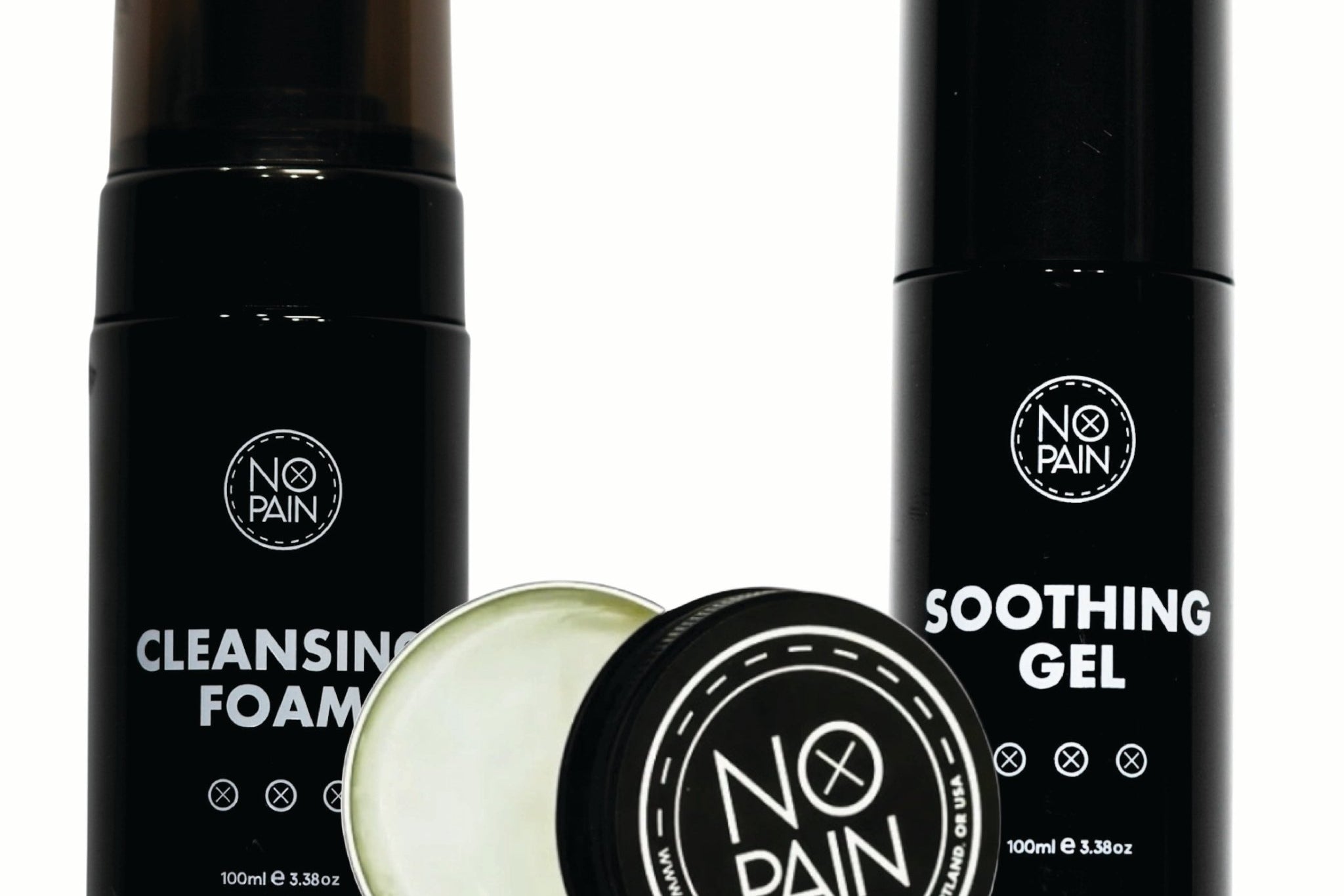
Aftercare is Still Essential: You must follow a professional aftercare routine to prevent infection. Our No Pain Tattoo Aftercare Bundle is perfect for this. The gentle No Pain Tattoo Cleansing Foam will keep the area clean, and a thin layer of our No Pain Tattoo Aftercare Balm will ensure the delicate lines heal without any scabbing.
The Verdict: If your artist suggests starting your large project with bloodlines, it is a sign that you are working with a thoughtful and experienced professional. It is a smart, strategic technique that allows for a more flexible and ultimately more cohesive final result on a massive piece of art. By understanding the process and committing to a great aftercare routine, you are playing an active role in the creation of your masterpiece.