

You're in the planning stages of a new color tattoo, and you're dreaming of a vibrant, eye-catching design. But how do you choose a color palette that will not only look amazing on day one, but will also stand the test of time? The answer lies in the art and science of color theory.
A great tattoo artist is a master of color theory. They understand how colors interact with each other and, more importantly, how they interact with the unique canvas of your skin. This is your guide to the basic principles of color theory in tattooing, helping you collaborate with your artist to create a stunning and lasting piece of art.
1. The Importance of Your Skin Tone
Your skin is not a white canvas; it is the base color that will mix with every pigment your artist uses.
-
Warm and Cool Tones: A skilled artist will choose a palette that complements the natural undertones of your skin (whether they are warm, cool, or neutral).
-
Contrast is Key: For darker skin tones, high-contrast and highly saturated colors like bold reds, yellows, and oranges are often the most effective at creating a vibrant, readable design.
2. The Rules of the Color Wheel
-
Complementary Colors: These are colors that sit opposite each other on the color wheel (like red and green, or blue and orange). Placing them next to each other in a tattoo creates a powerful, high-contrast, and dynamic look.
-
Analogous Colors: These are colors that sit next to each other on the color wheel (like blue, teal, and green). Using them together creates a smooth, harmonious, and pleasing blend.
3. The Secret to Longevity: Black is a Color
This is the most critical rule for a tattoo that will age gracefully. How tattoos age well is all about structure. A tattoo that is just made of soft, light colors without any black will often blur and fade into an unreadable shape over the years.
-
The Black Outline: A solid black outline is the "container" that holds your tattoo together. It ensures the design will remain clear and legible for decades.
-
Black Shading: Using plenty of black shading is the secret to making your colors "pop." The deep contrast of the black makes the adjacent colors appear more vibrant and saturated.
4. Understanding Pigment Durability
It's a fact that some colors are simply more durable than others. What tattoo color fades the fastest?
-
The Most Vulnerable: White, pastel, and yellow inks are the most susceptible to fading from sun exposure.
-
The Most Durable: Black ink is the undisputed king of longevity.
A great artist will use this knowledge strategically, using the more vulnerable, brighter colors as accents and the more durable, darker colors to build the foundation of the tattoo.
Aftercare for a Colorful Masterpiece
How to care for a new tattoo with a lot of color is all about preserving that vibrancy. The healing process is when the ink is locked in.
-
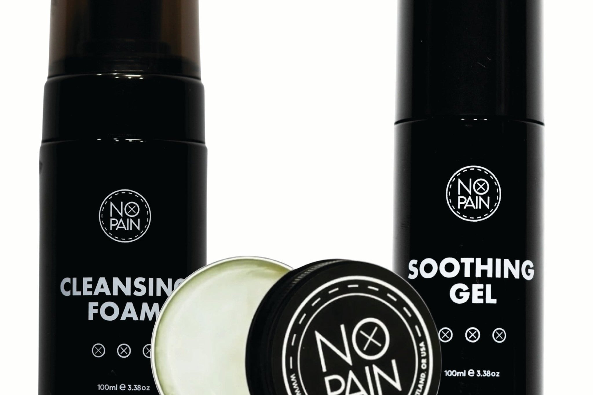
A flawless heal is non-negotiable. Our No Pain Tattoo Aftercare Bundle provides the professional-grade Cleansing Foam and Aftercare Balm needed to heal your color tattoo perfectly and lock in every vibrant hue.
The Verdict: Choosing a color palette is a crucial and collaborative part of the tattoo process. By understanding the basics of color theory and trusting your artist's expertise, you can create a tattoo that is not only beautiful but is built to last a lifetime.