

Lettering tattoos fail more often than people expect. The concept seems simple: words instead of images. But script and lettering require a specific skillset, and the most common mistakes (wrong font, wrong size, wrong placement, wrong artist) produce results that blur into illegibility within a few years. Getting it right comes down to a handful of decisions made before the needle touches skin.
This guide covers font styles and how they age, the legibility problem, placement, what to look for in a lettering artist, and how to protect fine line work through the heal.
In this guide
- Font styles
- The legibility problem
- Placement
- Finding a lettering specialist
- The session
- Aftercare
- FAQ
Font styles
The font is the design. Unlike image-based tattoos where style choices affect rendering, lettering tattoos live or die by the letter forms themselves. Here are the main categories.
Script and cursive
The most popular category for lettering tattoos. Script ranges from loose, handwritten-style lettering to formal calligraphic script with dramatic thick-and-thin strokes. It suits names, short phrases, and quotes where a personal, flowing feel is the goal. The tradeoff: script is the most vulnerable to legibility problems over time, because the letterforms are often thin, closely spaced, and connected. Minimum size and proper letter spacing are more important here than in any other style.
Old English / blackletter
Gothic letterforms with heavy, angular strokes and decorative serifs. Bold and high-impact, associated with traditional tattooing, religious contexts, and certain subcultures. Ages very well because of the thick strokes. Works best for short words or names; full sentences in blackletter become very difficult to read, especially at any meaningful distance.
Block and print
Clean, sans-serif or serif block letters. More neutral in aesthetic feel than script or blackletter. Works well for longer text that needs to stay readable, including quotes and dates. Fine print lettering (very small, clean print) is popular but has serious longevity concerns: print at small sizes blurs into unreadable blobs as the ink spreads over years.
Custom calligraphy
Hand-lettered by the artist rather than derived from an existing font. The best option when it's available. A skilled calligraphy tattooist will design letters that flow with your body, handle the thick-to-thin transitions that define good calligraphy, and account for how the piece will age. The result is unique and tends to read more naturally on skin than a computer font adapted to a body curve.
Fine line print / typewriter
Typewriter fonts and minimal sans-serif print have become popular in recent years. They can look clean and precise when freshly done. They also fade and blur faster than heavier styles because the strokes are uniformly thin. If you want fine typewriter text, go slightly larger than you think you need.
The legibility problem
Ink spreads. This is not a question of artist skill or product quality; it's the nature of pigment in skin over time. As the years pass, the edges of every tattoo line soften and expand slightly. For a bold-outline image tattoo, this barely registers. For fine script lettering with letters spaced closely together, it can turn readable text into indistinct smudging.
The two factors that determine whether your lettering stays legible are size and spacing. Too small means the letters have no room to spread before they merge. Too tightly spaced means adjacent letterforms run into each other. A competent lettering artist will tell you the minimum size for your chosen font to remain readable long-term. Trust that advice even if it means going bigger than you planned.
The most common mistake: choosing a font from a website example shown at 12pt on a screen and expecting it to translate to skin at a quarter inch. What looks refined at small scale on a screen becomes illegible in tattooed skin within five years.
Placement
Lettering has directionality and rhythm. Where you place it shapes how it reads and how it flows with your body. Some principles that hold across most cases:
Horizontal placements: The collarbone, forearm, upper arm, and ribcage work well for longer quotes or phrases because they give the letters room to run. The collarbone in particular is a popular choice, but the proximity to a curved bone means the letters need to be sized and spaced to account for how the skin moves.
Vertical placements: The spine, inner forearm, and side of the torso work for text that reads top-to-bottom. Vertical script can look elegant but requires the viewer to tilt their head; consider whether that fits the intention of the piece.
Short text and single words: Almost any placement works for a single word or short phrase. The wrist, inner wrist, finger (with real longevity caveats), behind the ear, and ankle are common choices. The smaller the text, the more important it is to go a size larger than feels natural to ensure it holds up.
What to avoid: Placing long phrases on highly curved surfaces (the side of a finger, the back of the ankle) where the letters will distort as the skin curves. Placing fine script in high-friction areas like palms, fingers, and feet, where the ink fades fastest.
Finding a lettering specialist
Not every tattoo artist handles lettering well, even artists who are very good at other styles. Lettering requires a specifically steady hand for long, consistent lines, an understanding of typography and how letterforms interact, and experience adapting text to body curves without distortion.
When reviewing a portfolio for lettering work, look specifically at: the consistency of line weight across a piece, how the letters space and balance, and whether healed examples are available. Fresh lettering often looks sharp in photos; healed lettering tells you whether the artist's work holds its crispness. Ask directly for healed examples before booking.
If you want custom calligraphy rather than an adapted font, look for artists who specifically describe calligraphy as part of their practice. The overlap between calligraphy skill and tattooing skill exists but isn't universal.
The session
Lettering sessions are typically shorter than large realism or portrait pieces, but they have a specific demand: stillness. A single involuntary flinch during a long script line produces a wobble that is very hard to correct cleanly. The precision required for lettering means you need to hold position more reliably than in almost any other style.
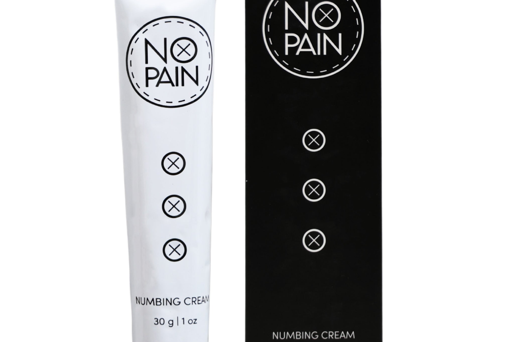
Numbing cream helps here, but not only for pain management. When you're not fighting discomfort, staying still is easier. Applied 90 to 120 minutes before the session and kept under wrap, maximum-strength numbing cream lets you relax and hold position through the whole piece. For longer pieces that span multiple hours, a numbing spray on broken skin extends the window mid-session.

Maximum-strength numbing in a thick, slow-absorbing base. Apply 90 to 120 minutes before your session, cover with cling film, and arrive already numb. Staying still gets a lot easier when you're not fighting the needle. 100% money-back guarantee.

Cream for pre-session numbing (90 to 120 minutes under wrap) plus spray for mid-session top-ups on broken skin. Covers the full session for longer script pieces without the distraction of mounting discomfort. 100% money-back guarantee.
Aftercare
Fine line lettering is among the most vulnerable tattoo work during healing. A single thin line that develops a heavy scab and loses pigment underneath it produces a gap in a letter that's very hard to touch up cleanly. The goal is to keep the skin moisturized enough that it doesn't form thick, pulling scabs, without over-moisturizing to the point of maceration.
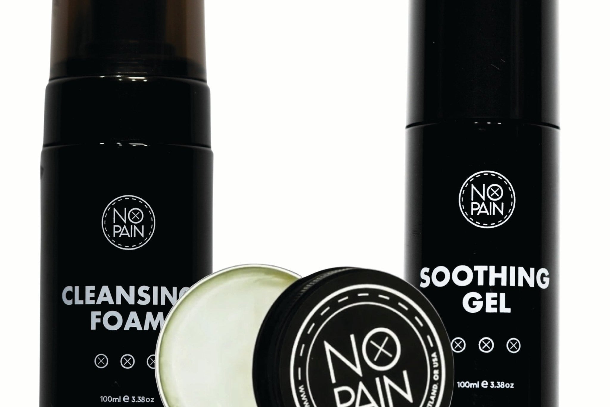
Wash twice a day with a fragrance-free liquid soap, pat dry with a clean paper towel, and apply a thin layer of soothing gel after each wash for the first three days. From Day 3 onward, as surface peeling begins, switch to an aftercare balm. Keep the area out of sun and water (no pools, baths, or soaking) until fully healed. And do not pick at any peeling or flaking: this is where letter detail is most commonly lost.
Keep the Lines Clean Through the Heal
The Aftercare Bundle covers the full healing routine: soothing gel for Days 1 to 3, aftercare balm from Day 3 onward, and cleansing foam for daily washing. The right moisture level at every stage keeps fine lettering from losing detail to heavy scabbing.
Shop the Aftercare Bundle →Formulated at Historic Tattoo in Portland, Oregon. 100% money-back guarantee.
FAQ
What tattoo fonts hold up best over time?
Bold fonts with thick strokes age the best: Old English / blackletter, block sans-serif at reasonable size, and heavier script with good letter spacing. Fine line script, tiny print, and typewriter fonts at small sizes are most vulnerable to blurring because the thin strokes merge as the ink spreads over years. If longevity matters, go bolder and bigger than you initially plan.
How small can a lettering tattoo be?
It depends on the font, but for most script styles, individual letters should be at least 5 to 6mm tall to remain legible over time. Very fine print can go smaller initially but fades faster. Your artist will give you a minimum size recommendation for your specific font; take it seriously. What looks elegant at small scale on screen often becomes illegible on skin within five years.
Do script tattoos blur?
All tattoo ink spreads slightly as it settles into the skin over years. Whether a script tattoo blurs noticeably depends on the line weight, letter spacing, and placement. Fine script with letters close together on sun-exposed or high-friction areas (wrists, ankles, fingers) is most susceptible. Bold lines, proper spacing, and protected placements hold much longer. An artist who specializes in lettering will design your piece to account for this spread.
Where does lettering tattoo hurt the most?
Lettering placed over bone (collarbone, ribs, spine) tends to be more painful than fleshy areas. The ribcage and sternum are consistently rated among the most painful placements. Inner wrists and inner arms are more sensitive than outer surfaces. The placement itself matters less for lettering than for image tattoos, though, since sessions are usually shorter and stillness is more important than enduring hours of pain.
Can you get a lettering tattoo touched up if it fades?
Yes, touch-ups are common for lettering work, particularly on high-fade placements like wrists, hands, and ankles. Touching up fine script is more difficult than touching up bold work, because adding ink to a blurred thin line requires a very steady hand and good matching. This is another reason to find a lettering specialist for the original piece: someone who did the work originally will do a better job touching it up.
Should I use a font I found online or ask my artist to design custom lettering?
Custom lettering from an artist who specializes in calligraphy is almost always better than a font grabbed from a website. Pre-designed fonts are made for screens and print, not for curved skin that moves and ages. A custom lettering artist will design letter spacing and stroke weight that works for your specific placement. If you do bring in a reference font, treat it as direction rather than a literal spec, and trust the artist to adapt it appropriately.