



Color selection is one of the decisions that most affects how a tattoo looks ten years from now. The colors you choose, how they interact with your skin tone, and whether they're applied with enough density to hold their saturation all determine whether the piece ages beautifully or fades into something unrecognizable.
Here's how to think through the palette before your consultation.
In this guide
- Skin tone: the canvas you're working with
- Which tattoo ink colors last longest
- Color theory for tattoo planning
- Working with your artist on color
- How aftercare affects color retention
- FAQ
Skin tone: the canvas you're working with
Your skin's natural pigmentation is the base layer that sits beneath the tattooed ink. The two interact — lighter colors over deeper skin tones may not have enough contrast to read clearly, while certain saturated tones pop more vibrantly depending on the underlying melanin.
Fair skin is the most versatile canvas for color tattooing. Bright, saturated colors generally show up clearly. The exception is very pale colors — white, pastel yellow, light lavender — which may not have sufficient contrast against fair skin to stand out at any distance.
Medium and olive skin works beautifully with rich jewel tones: emerald green, sapphire blue, ruby red, deep purple. Warm colors like orange and gold also carry well. Pastels and very pale colors tend to disappear against medium skin tones.
Dark and deep skin tones require high saturation and contrast to read well. Bright, warm colors — true red, vibrant orange, golden yellow — tend to create the strongest visual impact. Deep blues and greens work well too. Light and cool-toned pastels typically don't show up with enough clarity to justify using them, and experienced color artists on dark skin will generally steer clients away from those choices.
Your artist should be raising these considerations during the design conversation. If they're not asking about skin tone when discussing color options, that's a signal to ask explicitly.
Which tattoo ink colors last longest
All tattoo ink fades over time as the dermis regenerates and sunlight breaks down pigment molecules. The rate varies significantly by color.
Black ink is the most durable. The carbon-based pigment is denser and more resistant to UV degradation than any organic pigment. Black ink can hold its depth for decades with reasonable sun protection.
Dark blues, greens, and deep purples are the next most durable. These pigments are chemically stable and tend to maintain their depth reasonably well over years.
Reds and warm colors hold up well when applied at full saturation by a skilled artist. The pigments are somewhat more reactive to UV exposure but generally age gracefully when applied correctly.
Pastels, white, and yellow fade fastest. These light pigments have less density and are more vulnerable to UV breakdown. White ink in particular tends to soften to near-invisible within a few years, and pastel colors often require touch-ups to stay looking intentional rather than simply faded.
Artists who work extensively with color often use a skeleton approach: build the tattoo's structure from black and deep tones, and use the more vulnerable lighter colors as accents rather than primary fill. This makes the piece more resilient to aging — the fundamental structure stays legible even as lighter accents soften over time.
Color theory for tattoo planning
Limit the palette. The most visually powerful color tattoos often use two to four colors, not twelve. A tightly constrained palette gives the eye clear focal points and makes the piece read from a distance. Classic American Traditional does this deliberately — limited palette, bold contrast, easy to read at any distance even decades later.
Complementary vs. analogous color relationships. Complementary colors (opposite on the color wheel: red and green, blue and orange) create high contrast and visual energy. Analogous colors (adjacent on the wheel: blue, teal, and green) create a more harmonious, blended look. Neither is objectively better — they serve different aesthetics. Know which effect you're going for.
Don't underestimate black. Black outlines and shading do more to make color "pop" than the colors themselves. The contrast between saturated fill color and a clean black outline is what gives traditional and neo-traditional tattoos their visual impact. Without adequate black, color tattoos often look soft and undefined as they age.
Working with your artist on color
When discussing color with your artist, bring reference images — not just of the design concept, but of the specific color mood you want. "Blue" can mean anything from pale powder blue to deep navy to electric teal. A visual reference gives your artist an accurate target rather than an interpretation of a word.
Ask to see healed color work from their portfolio. Fresh tattoos always look more saturated and vivid than they will after healing. An artist who shows healed work is showing you what you'll actually have — and artists confident in their healed results are generally more skilled than those who only show fresh work.
If you're concerned about how specific colors will read on your skin, ask whether a small test patch in an inconspicuous area is an option. Not all artists offer this, but it's a reasonable question for complex or expensive pieces where color accuracy matters a great deal.
How aftercare affects color retention
A bad heal can strip color out of a tattoo as thoroughly as years of sun exposure. Heavy scabbing — often caused by inadequate moisture — tends to take ink with it when the scabs release. The ink you're trying to protect has to make it through the healing process intact.
Protect the Colors You Chose
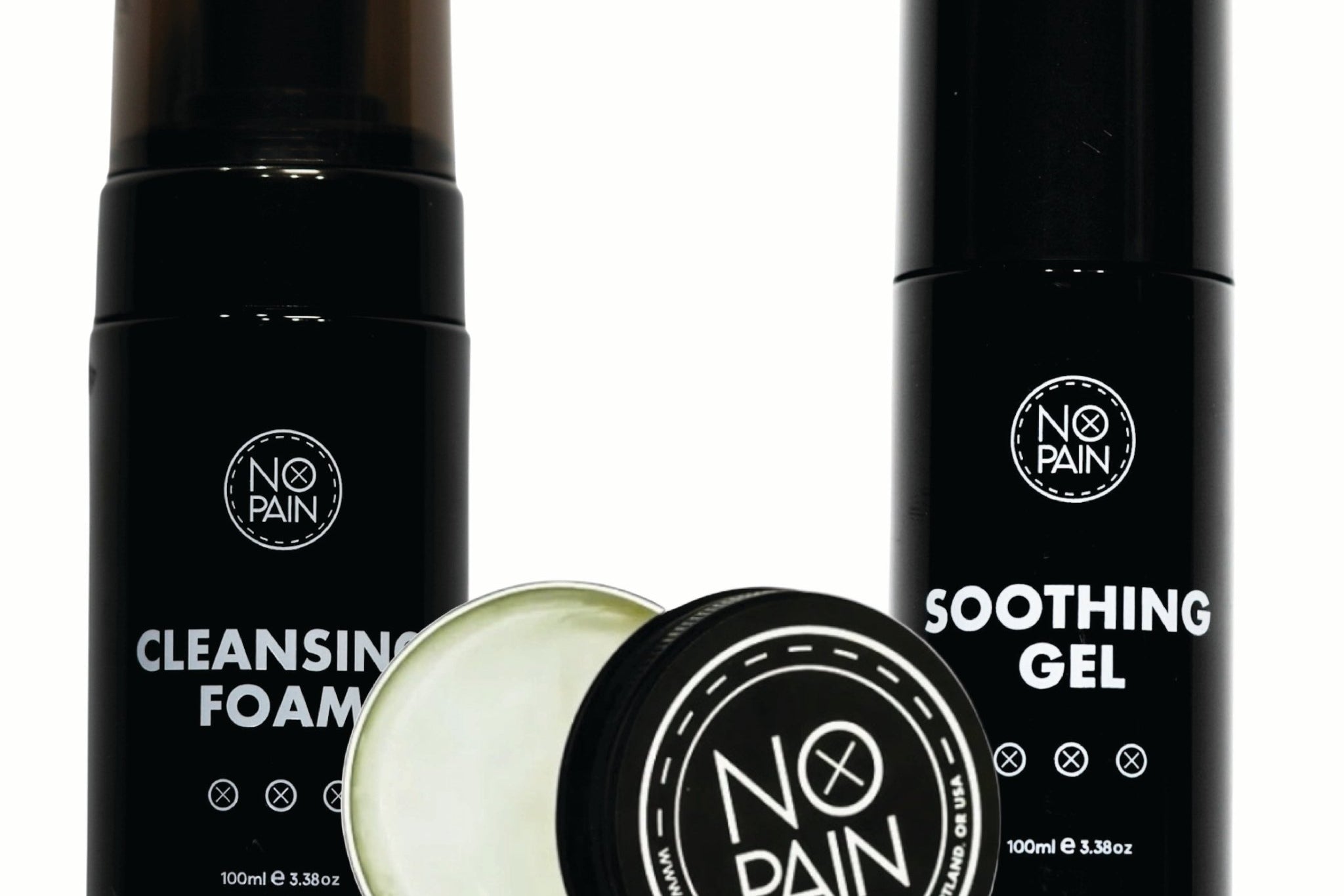
The Aftercare Bundle is designed to prevent the heavy scabbing that pulls ink during healing: soothing gel for the first few days, balm from day three onward, and cleansing foam for daily washing.
Shop the Aftercare Bundle →Formulated at Historic Tattoo in Portland, Oregon. 100% money-back guarantee.
FAQ
What tattoo colors look best on dark skin?
High-saturation, high-contrast colors work best on dark skin. True red, vibrant orange, golden yellow, bright coral, and deep greens and blues all read clearly against deeper skin tones. Pale pastels, white ink, and light lavenders typically don't have enough contrast to show up well. An experienced artist who regularly tattoos dark skin will know how to select and adjust colors for the best result.
What tattoo ink colors fade the fastest?
White, pastel, and light yellow inks fade fastest. These low-density pigments are most vulnerable to UV exposure and the body's natural immune response to the ink. White ink in particular often fades to near-invisible within a few years. Bright warm colors like orange and red fade at a moderate rate. Black ink is the most durable and maintains its depth longest.
Should I get a color or black and grey tattoo?
This depends on the style of design, your skin tone, and how you want the piece to age. Color tattoos done well have a painterly quality that black and grey can't replicate. Black and grey tends to age more predictably and works particularly well for realism, portraiture, and detailed illustrative work. Your artist's specialty should factor into this — an artist producing work outside their primary discipline typically produces weaker results.
How do I know what colors will suit my tattoo?
Start with the style: each tattoo style has a characteristic color approach. Then consider your skin tone and which colors will read clearly against it. Finally, look at the specific design — a botanical piece might suggest a natural, earthy palette; a geometric piece might use high contrast or monochromatism. Bringing color reference images to your consultation is the most reliable way to align your vision with your artist's execution.
Does color tattoo aftercare differ from black and grey?
The fundamental aftercare process is the same: keep the tattoo clean, moisturized, and protected from sun exposure during healing. Color tattoos benefit particularly from consistent sun protection after healing, since UV exposure degrades color pigments faster than black ink. Using a broad-spectrum SPF on healed color tattoos — especially those in exposed areas — extends the vibrancy of the colors significantly over years.
How do I build a tattoo color palette that works long-term?
Use black and deep tones as the structural foundation, and reserve lighter or more vulnerable colors (pastels, yellow, white) for accent use rather than large fills. Keep the overall palette limited to two to four colors so the piece reads clearly as it ages. Discuss your long-term goals with your artist — a good color specialist will design the palette with the healed and aged result in mind, not just how it looks fresh off the needle.